
Piciņa
Website development · Jēkabpils
Menu, delivery and contacts on one clear page
Client — Piciņa pizzeria in Jēkabpils.
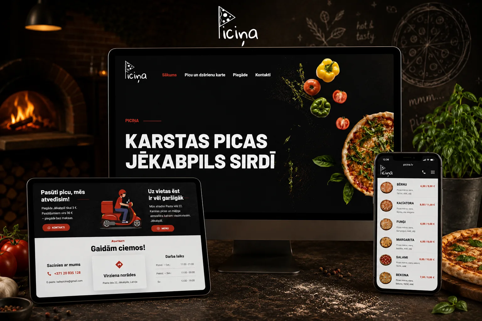
We adapted the WordPress site to the pizzeria’s daily needs: visitors immediately see the menu and prices, delivery terms, address, opening hours and phone. We separately rebuilt the mobile layout and page-loading path.
Brief
Make the menu easy to find before the call
A pizzeria visitor does not need a complex site structure. They want to scan dishes and prices, check delivery or find directions. We placed all essential information on one page and adapted it for phone, tablet and desktop.
Structure
Four steps from the first screen to an order
Navigation jumps to the right section on the same page — no extra page load.
Home
Brand and primary offer.
Menu
Pizza, snacks, drinks and prices.
Delivery
Terms and a clear action.
Contacts
Address, phone, hours and directions.
What we did
What we built and adapted
We designed the site’s appearance, structure and behaviour around Piciņa’s needs.
Visual treatment
Designed the visual system and Elementor home page with a dark base, red accents, bold headings and a food-led composition.
Menu layout
Organised pizza, snack and drink sections. Names, ingredients and prices remain scannable on a small screen.
Mobile hero
Built separate decorative layers for mobile, with viewport-specific positioning, overlays and text contrast.
Mobile menu
Kept title and price on one line, and turned the long drink category list into a compact two-column grid.
Delivery and contacts
Brought delivery terms, phone, address, opening hours and directions together on one page.
Content management
Content is editable in WordPress and Elementor; WP Cafe tools support menu sections.
Responsive work
The mobile version is not a shrunken desktop page
Mobile changes more than column count. Hero decorations are injected and positioned for the viewport, price rows keep their rhythm, and the long category list takes substantially less space.
- Separate phone and tablet composition
- Contrast overlay for readable copy
- Name and price kept on one line
- Compact category grid
Performance and search
Fewer unused assets, faster repeat loads
WordPress and the page builder loaded files the homepage did not need. We built a separate optimization module that serves a saved page copy, removes unused assets and automatically purges cache after edits.
Full-page cache
Ready HTML for anonymous visitors, refreshed automatically after content changes.
Self-hosted fonts
Barlow, Permanent Marker and Roboto are served by the site itself.
Asset cleanup
Unused Revolution Slider and WooCommerce cart files are removed from home; non-critical scripts are deferred.
Clean sitemap
Only the published homepage remains in the search sitemap; technical menu records do not create indexable pages.
Technical solution
Technology
WordPress manages content, while focused PHP, JavaScript and CSS modules handle mobile layout, performance and indexing.
Need a website for a restaurant or café?
We will build a clear menu, mobile layout and fast site that is easy to manage. Reply within one working day.
Questions and answers
About the build
Why is Piciņa a one-page site?
Pizzeria customers need the menu, delivery and contacts. A single page makes those faster to find.
What did KVANTS adapt for mobile?
Hero composition, price rows, menu spacing and the drink category grid for phones and tablets.
What performance work was implemented?
Full-page cache, self-hosted fonts, unused asset removal and deferred non-critical scripts.
Other projects
You may also like these projects.
This project is part of our service: website development.
Website
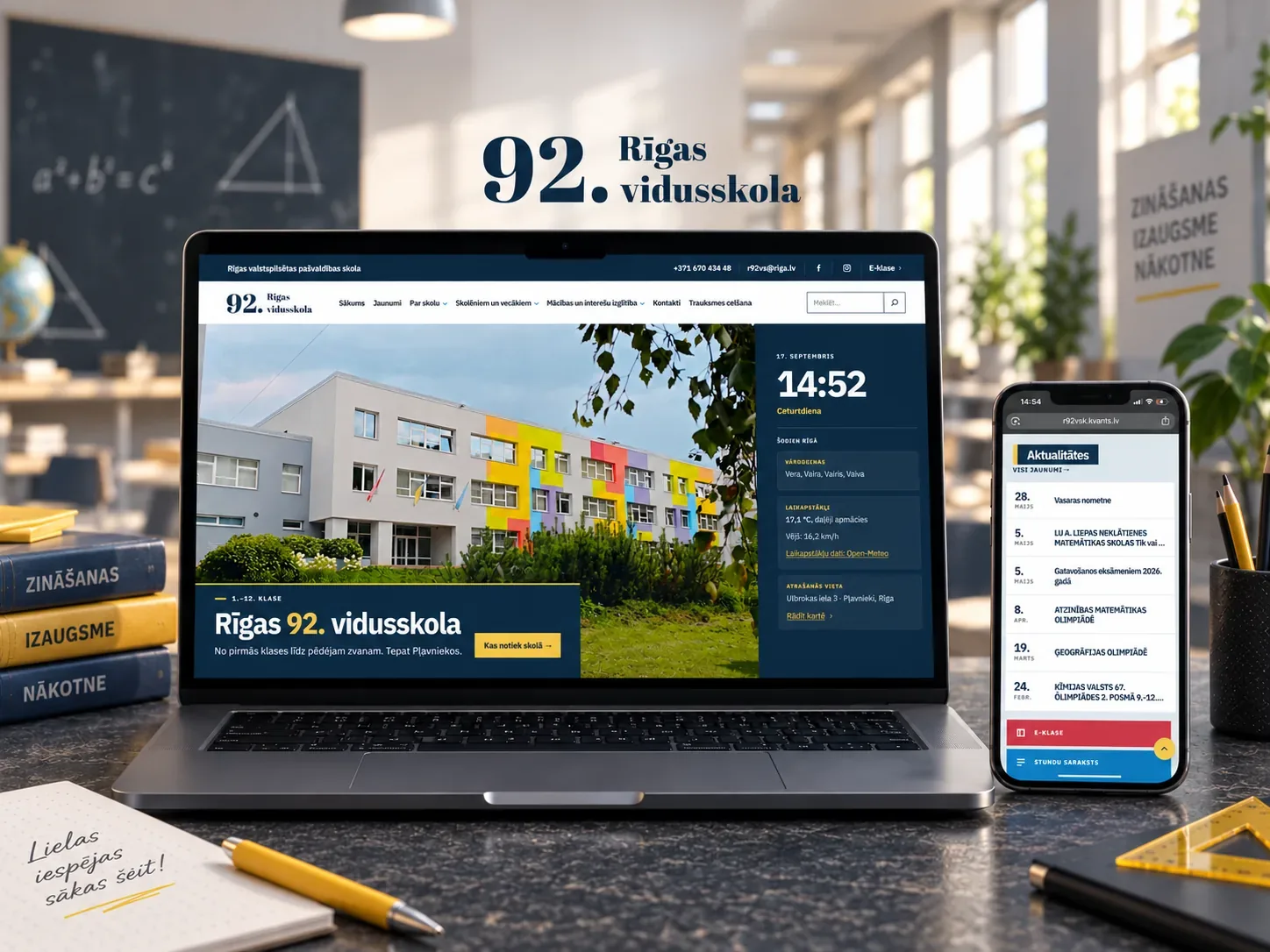
Rīgas 92. vidusskola
We built a new WordPress website for Rīgas 92. vidusskola with our own block theme and plugin, and recovered the old Joo…
Website
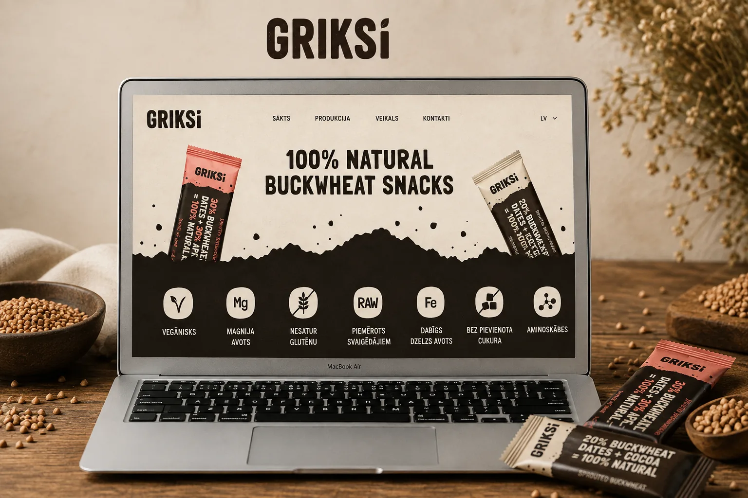
Griksi
Moderna un funkcionāla mājaslapa ar skaidru informācijas struktūru un ērtu navigāciju.
Website
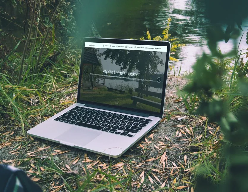
Atpūta Sprogās
Moderna atpūtas kompleksa mājaslapa ar rezervāciju sistēmu un pilnu pakalpojumu aprakstu.